
It just makes good business sense to make your website as accessible as possible to as many consumers as possible, and in this day and age, you simply cannot afford an antiquated website that doesn’t conform to the size and shape of mobile devices. According to Statista, the percentage of website traffic that comes from mobile users has been hovering around 50% for the last couple of years. This means at any give time, as many as half of the people viewing your website could be doing so on smartphones, tablets, and other mobile devices.
What will these people see when they encounter your website? If you have yet to implement responsive or adaptive web design, they’re likely to see an interface designed for a computer monitor, which means the layout could be wonky and the content will not size to fit their screens. They’ll have to scroll left, right, up, and down to view content, and this obviously isn’t ideal.
It’s even worse than that, though. A few years ago, Google launched a massive mobile first initiative, meaning they started prioritizing search placement for websites featuring accessible mobile design. Why? Because they felt it would provide the most relevant results for the rapidly growing market of mobile users.
In other words, it’s way past time to upgrade. The only question is whether you should opt for responsive or adaptive web design. What are the differences? Is one better than another? Here’s what you need to know to get the most out of your website overhaul.
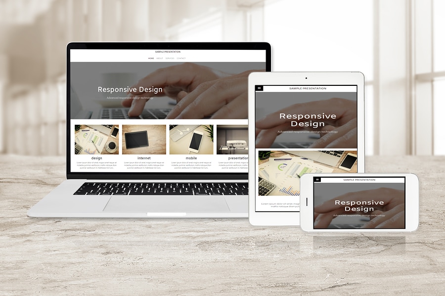
What is Responsive Design?
Responsive design is essentially a one-size-fits-all solution for displaying your content on an ever-growing list of computers, laptops, and mobile devices. This is because it’s a fluid format that adapts your website to literally any screen dimensions. No matter what device a user is viewing your website with, it will shrink, grow, or change dimensions to fit the screen size for optimal viewing.
It works by detecting characteristics like the height or width of the screen or the display type, for example, and then using this information to adapt the content and layout. If the screen rotates from portrait to landscape (as when someone turns a smartphone on its side), the image will adapt. This eliminates pain points and makes for a positive user experience.
What is Adaptive Design?
Adaptive design also sizes for different screens, but it’s based on preset resolutions, which means you have to account for a number of devices of varying sizes. Typically, there’s a standard number, but this could limit viewing potential. It is, however, much easier to retrofit existing websites with adaptive design, which is why it’s a popular choice, despite limitations.
Which is Better?
There are pros and cons to both types of design, and the one you choose may depend on your budget or on plans to perform a major overhaul of your website down the line. The one major benefit of choosing responsive design is that it fits with Google’s mobile first directives. While they don’t specifically cite adaptive design as being unacceptable, they do recommend responsive design.
Still, both types will make your website accessible for mobile browsing, which is Google’s end goal, so it’s anybody’s guess if it makes a real difference. You’ll simply have to discuss your goals and your budget with your web design experts and decide whether responsive or adaptive design best meets your needs, now and moving forward.
Leave a Reply: