The ‘hero image’ ideal came into being a few years ago — iStock had an article on them way back in 2010 — but only recently has it gone fully mainstream, with a few big-time companies like PayPal adopting the hero image motif on their login screen.
You’re getting ahead of yourself, Jared.
Right — let’s define hero image for everyone. A hero image is a large — almost always screen-width and often full-screen — image that dominates the main, login, or landing page of a website. The term ‘hero image’ comes from magazines, where it originally referred to full-page advertisements that simply showed a glorious picture of the product either in package or in use. The purpose of a hero image is to wow the user, plain and simple.
Narrative In a Single Frame
Web designers have known for…well, as long as the web has been around, that narrative structure (‘telling a story with your site’) is a powerful way to get people to engage. The modern hero image is the (current) pinnacle of that concept, using an unavoidable and usually animated spectacle to draw the user into a story being told on their screen. For example, PayPal’s hero images all show someone — clearly implied to be a small business owner — caringly creating their product. Then the text says something pointed that both explains the image and explains what PayPal means to the person in the image: “You make it, we’ll make it pay.”
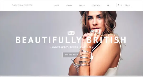
Even when the hero image is static, it can powerfully invest the user with a particular notion or image that they will take with them as they enter the site. Check out this out:

How can you not see that and come away feeling like whatever’s on the other side is going to be both delightful and London-y? You barely need to notice the words ‘silver jewelry’ to grasp the fact that the site is about just that — the picture’s only real details (besides those gorgeous eyes, naturally) are the ornaments that young lady is wearing. The story they want you to have in your head when you click ‘browse shop’ is there.
But what about ‘content’?
Every SEO guy in the world will tell you that content is the most important thing on your website, and in most cases, that content largely consists of text — because text is what Google parses, takes notes on, and returns in search results. How can you hope to have kick-ass SEO if your webpage is a giant picture where even the words are part of the frame?
Well, there are a few ways you can deal with that. In cases of uber-businesses like PayPal, they don’t need SEO on their landing page; you go there because you’ve already heard of PayPal and you want to sign up. If that’s not you, there are still two ‘levels’ of SEO you can go toward. You can either embrace the hero picture in full and simply slide some keywords into the picture’s URL, alt tag, and title tag — or you can put the hero image such that it fills up everything above the fold, and have actual content down below.
Personally, I feel like that second option is the way to go — it still gives you plenty of room to have a significant amount of content, but it gives users the narrative power and ‘wow factor’ of the hero image, which is the entire point in the first place.
?


Leave a Reply: