
Did you know that more than 3 billion people around the world actively use the internet? That’s a big number and 80 percent of those users access the internet from smartphones. If you are not targeting your audience through mobile search capability and providing them with a quality experience, you are letting a huge chunk of the market slip away. To stay current with consumer trends you must familiarize yourself with responsive web design.
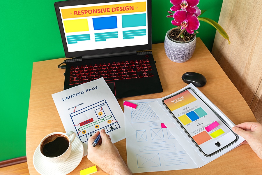
What Does Responsive Web Design Mean to You?
If you are not yet familiar, responsive web design focuses on ease of use which responds to user behavior and their environment based on a variety of device screen sizes, layout, and operating systems. Responsive web design works with a complex collaboration of grid layouts and imagery that ultimately allows a website to easily adapt to any device and its specific resolution scripting, and other functions.
Being fully aware of this critical type of web design gives you consistent and critical perspective of your customer base and in today’s mobile-heavy world, every advantage is welcome. When it comes to creating, launching, and maintaining a mobile-friendly website; review the following helpful tips to give visitors and potential customers a memorable experience:
Be Responsive
In the good ol’ days, websites were designed for static computer screens and fixed sizes. Far more popular today is online searching via mobile devices, hence the origin of responsive web design. Mobile websites must include responsive design to meet the needs of on-the-go consumers.
Easy Navigation
The less clutter, the better. Users want easily accessible content. If you operate an ice cream shop, show a cone icon that leads to a full menu when clicked. The menu can drop down or fill the screen or take other directions; as long as it quickly appears in front of the user’s eyes.
Be Font-Savvy
Large font sizes grab attention but they don’t always work for smaller screen sizes of mobile devices. A general rule of thumb is an 18-20 point font size works well for desktop websites but it’s best to stick closer to 15 or 16 for mobile devices. While you’re at it, take a look at your site’s headers and adjust their size as well.
Button Up
Users are all over the place with their thumbs, navigating as fast as the device can keep up. To meet users’ navigating prowess, your site must include clickable buttons without requiring extra searching or very tricky activation. Best tip: Err on the side of large buttons for mobile sites.
Keep it Simple
A mobile device has less space to work with so it’s very important to simplify your site’s information. Leverage a site’s flexibility by hiding information such as addresses and phone numbers within an icon, or detailed business information linked through an image.
Optimize those Images
Large, high-res images are notorious for slowing down a site’s speed and loading time. If a web page takes too long to load (and today’s consumers are keen on instant gratification), the more likely it is you will lose that visitor and potential customer. Only include images no larger than twice your display size.
Leave a Reply: