Content Marketing and The Power of EMPHASIS
Emphasis is one of those tools that separates a design superstar from a dude hacking together a webpage in his spare time. It’s a tool, like any other, but unlike a screwdriver or a spoonful of red pepper flake, it’s not always obvious where it goes. Here’s my short but sweet primer:
Emphasis Should Be Minimized
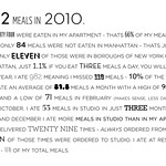
The rule with emphasis, be it bold text, big arrows pointing at stuff, or whatever else you might decide to use, is that if you emphasize everything, you end up emphasizing nothing. Those seventeen-foot-tall sales pages that are chock full of bright red headings and highlighted text and bullet points are fun to look at, but they fail the most basic design test: does it maximize the message and minimize the noise?
Emphasis Should Be On The Point
There are a lot of things you could emphasize about a piece of content.
There are a lot of things you could emphasize about a piece of content.
There are a lot of things you could emphasize about a piece of content.
There are a lot of things you could emphasize about a piece of content.
But in general, unnecessary emphasis does exactly what it does in the sentences above: it changes the way you read text, and by doing that, it changes the meaning of the text. If you only emphasize the actual point of each section, you ensure that the most salient and important parts of each message get through.
Emphasis Comes In Many Different Kinds…

…and Each Has Its Place
The point here is that, somewhat in counterpoint to the first concept above, it’s OK to use multiple different emphatic devices if you use each one differently. For example, using bullet points to name the features of a product and then bolding the most salient few words of each feature, and then also pointing an arrow at the single most important feature among them — that’s approaching saturation, but it’s acceptable. It’s acceptable precisely because each kind of emphatic device serves to focus attention on a different layer of meaning. It’s when you start bolding all of the text on every bullet point and spamming arrows at every paragraph that you lose the point of all that emphasis.
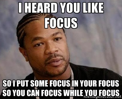
Learning how to use your design to draw attention where you want it most is an absolutely key skill for any web designer — or content creator. Focus their focus on what you want them to focus on, because like Jackie Chan told Jayden Smith: “Your focus needs more focus.”


Leave a Reply: