
Websites have some content that’s static (doesn’t change as you look at it) and some that’s dynamic (which does). Dynamic content attracts the eye more than static content does, just like bold text draws the eye less than normal text.
The human eye doesn’t smoothly scroll like a mouse wheel — it essentially takes a ‘snapshot’ of everything within an inch or two of it’s focal area (assuming you’re looking at something arm’s length away), and then ‘jumps’ to the next spot. One of the great tricks of speedreading is to train your focal area to be larger so that you can make fewer jumps as you read.
Directing Attention
What this means to web design is that you can (and should) use your dynamic or dramatic elements to get the user’s focal areas where you want them — and then put the most important information right next to it so that they catch it in the periphery of their focal point.
Here’s a great example:
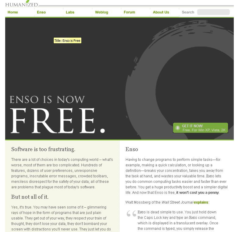
Look at the word ‘Free’. You can’t really help but look at it, can you? And right there in your periphery, you get two vital bits of information: they’re talking about something called ‘Enso’, and it’s something different from all the rest of the software, which is frustrating (implying ‘Enso’ isn’t.) Free and not frustrating? Now we’re talking!
But that’s not all – on the other side of the page, you have this beautiful Zen-like painbrush circle that points out the one thing on the screen that has color: the all-important call to action. And when you look at that, you can clearly see, in your focal periphery, the title “Enso” — ah ha! Know you know where to look to see what all the fuss is about, and you know where you get it if you decide you want it. It’s design genius. Oh, and the only bold above the fold is another reminder that Enso is free, just in case you weren’t sure that the huge ‘Free’ you saw first wasn’t actually relevant. And just for fun, the mouseover title on the picture says it again — these guys know how to appeal to a typical web surfer, don’t they?
By using visual elements to focus user’s attention, you can simultaneously pique their interest and guide them toward the elements that they’re logically most going to want to see next. The more easily your design guides them down the rabbit hole, the more they’re going to intuitively trust the company behind the site and the product it’s offering.
Similarly, big colorful buttons or other elements that point out the functional parts of a website (the parts that offer actual interactivity) are a great way to guide a user’s attention to the “things to do”. That allows them to interact more easily and intuitively, which again means more trust and, in turn, better sales.
Leave a Reply: