
Cognitive load is an interesting concept. Basically the idea is that every brain only has a finite amount of ‘working memory’, and the more of your working memory you have taken up with other things, the more difficult it is to work on any one problem. As an extreme example, imagine taking a Physics test…and then imagine taking that same Physics test in Spanish (or some other language you studied for a few years in high school.)
Even if you have your English-Spanish dictionary right there on the table, the test in Spanish is going to be a heck of a lot harder, and not just because of the extra time it takes to look things up. Your brain actually just quits at some point, when there are too many steps you have to take to get from where you are to the solution you want.
Reduce Cognitive Load
Generally speaking, you can assume that when someone is surfing the web, their working memory is already pretty occupied with a few other things. They’re probably singing along with What Does the Fox Say, talking to a companion that’s in the room or the next room, browsing for a few other subjects in a few other tabs, and eating a snack. None of those tasks are individually overwhelming, but it means that their working memory isn’t at it’s full capacity.
In short, you have to assume that the people using your website are tired, distracted, and already thinking about some heavy subjects.
That means you need to make your webpage design
- Obvious
- and Self Explanatory
Do you like how I set those two items apart from the rest of the text by bulleting them? That’s because they’re probably among the most important few words on the page — so if you’re a tired, distracted person, you can scan straight to the really important part. Leading by example, that’s me.
To put it in more detail, what you want is to think about questions someone who is clicking to your website for the first time has, what new questions are going to be created when they look at your website (hopefully zero), and how all of those questions are going to be answered.
Here’s an example:
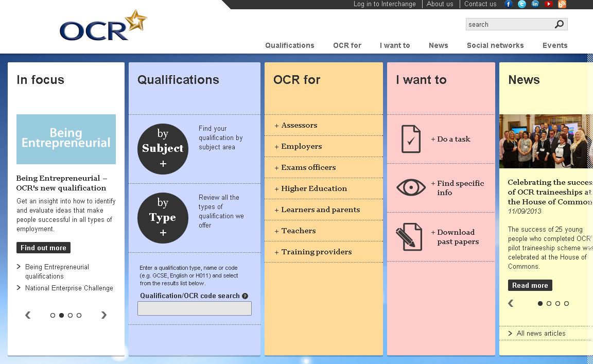
OCR is a company in the UK that does exams for a variety of school and industry-related purposes. But when you look at their website, you have essentially no idea of who they are or what the website is for. There’s even a link at the top there that says “I want to…”, and when you click on it, it takes you to a menu where your options are — no joke — “Do a Task”, “Find Specific Info”, or “Download Past Papers”. Only one of those actually gives you the slightest clue what’s going to happen when you click on it, and it’s the one that you’re going to click if you’re already familiar with the site..
In short, don’t do that — keep your navigation brainlessly simple, your calls to action huge and obvious, and your distractions from those to things to a minimum. Whitespace, hierarchical navigation, cutting back on the dynamic content, and color-coding are all classic and highly effective ways of reducing cognitive load — take advantage.
Leave a Reply: